We knew that to make Gradefix a success we'd have to have a sleek user interface.
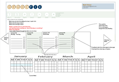
We started with nothing more than a list of the tasks in the beginning and it was obvious very quickly that wasn’t going to work. Next we thought that a calendar-like view should be the way this is made. We started with a sketch like this:

Then we spiffed up this look by adding color:

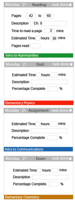
We thought it would be nice to be able to click on a class and that would light up those tasks. At this point we had made a major step on our think by considering the idea that a task could be added right there on the same page. So I broke up each task into four categories Reading, quiz, assignment, and exam.

There are some downfalls to having such complicated entries for each of these types of tasks, mainly that it would slow inputing tasks too much. However, we thought maybe they could be combined and worked through.

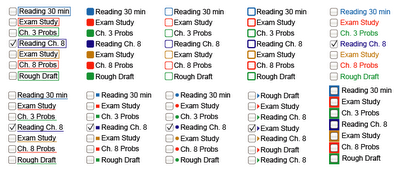
We decided we could save a little space by using color to show which class was related to which task. Then we thought maybe it be sorted even more by combining the task type and the color of the class. So we made these tags.

Combining the tags and and the previous scheduling idea we got this. We thought with the coding that the gray background look was going to be the way to make it clearest, and this was the birth of what I like to call the Windows 3.0 shell.

However, we ran into major problems put in the descriptions in such a sort spaces.
But, we did discover what we started calling the Task Manager, a concise tool for adding tasks. We thought maybe if you click on a class, then the task type, choose a date and put a little note of what to do and we’d have it. The problem was that there wasn’t a space for a little note. So we thought maybe we could have a box open up and it would show the note, something like this.

Well, this was going to be too much work. Come on you don’t want to have to click every task to see the description, that was not realistic. So then we had a major "aha" and thought what if we made a three day view. There were little things we decided to look at like the due tag to save space.

We also added due tags as another space saver.

We started sitting on the three day view. It took care of our task decription problem. In the mean time I started devising the update mode, a place to update the tasks you've done.

With time I started to get bugged by a thought of the three day view, it just didn't feel quite right to me yet. One day it came to me, this is kind of like my email. So I decided I better just lay it out for the heck of it to just see what that would look like (figuring it would suck).

I loved it, but had to let go of the old one, which was hard. It helped that everyone I showed the new email type version to liked it better that turned the tide. The email layout had a major upside of more data in a smaller space, and none of those hidden notes. There was still the question as to how to enter the tasks. So our "Task Manager" idea was revisited, but not without our typical trial and error. The first one here is called the squatty one.

Nope, that wasn’t right. So we made these variations of it.

Our main goal for the task manager was rapid task entry, so we ruled out the drop down bars because they would be too slow. We finally decided on the task bar to the right. Adding the schedule and the task manager yielded:

For sure we thought we had finally found the version we’d be happy with we still tinkered with it to work out the kinks. We decided though it was a nice feature to have the classes up on the top it seemed repetitive so we cut it out.

Update mode would be easier and less confusing if we just used what was there.

Well we decided it was time to go back into production on creating a real version of our windows 3.0 version. So we made it live to see and start testing it out again.


Well after all this work of making this work… I still had one more idea. I woke up on the Fourth of July about 5 am thinking of my windows 3.0 version and I thought "I hate it, I want it to look hip, not old school Windows". The gray bothered me as well as the too many colors problem. I decided maybe the task type could take color then we’d only have to use four colors.

Next I thought maybe we need no color-coding at all and I made this one.

Mac and I liked this one, but Taylor was still a fan of the color-coding. I started to ask around and there was a fan base for the color coded tabs, so I thought maybe we could shorten them down a lot to just the color and one letter as to what type of task it was. So here is the latest and greatest.

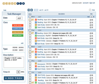
This has been our favorite one, so we went back to the drawing board with the programming, and remade it to look like this. In the mean time, we decided that making the background yellow on due dates would save a little more space. Another thing we changed and liked was that all the time was aligned in the same column. When we made this design live, the light blue didn’t look right so we made it dark to match the logo. That brings us to the present version which we feel is getting pretty sleek.
(If you don't have a Gradefix account to log in and see the current one, you can
create one or check out some screen shots on the
Gradefix home page.)

