
The Evolution of "My Account"
We used to call Gradefix "Scholar". These first pictures are Scholar mock-ups that Taylor did to see how many pages we’d need and how they’d hook together. Initially, we thought a person would need to add all their information up front to make it work.


In the mean time, we’d been through trial of finding a designer, getting our logo, and getting a basic layout.
Mac took our designer's look and feel and created this version of Gradefix, around December 2005 and January 2006.


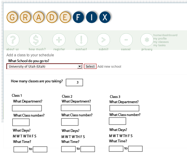
We found there were some problems in this approach, mainly in that we still had no idea how all of this information would fit into the scheduler cleanly. On the input side we also faced one our biggest problems of having tons of inputs. We first thought that the user would need to enter their entire syllabi and this was going to be ridiculous.
On the profile and class pages we started by asking ourselves what was all the info we wanted, instead of what was only the essential inputs we needed.
Because our budget was so small Taylor and I took it upon us to redesign the pages using some of designers best ideas.
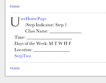
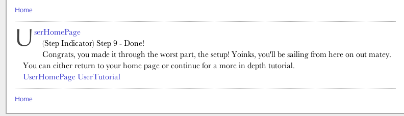
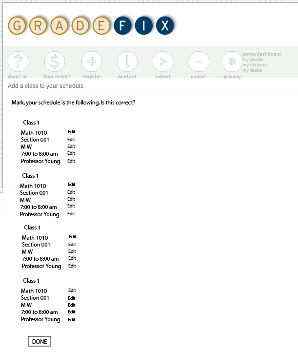
When our betas tried the above shown version, they didn’t understand what they were doing or where to click (as much as we thought AJAX was cool, it was hard for people to use at least for our app). My first thought was maybe I should show them a step-by-step bar to let them know where they were at in the process of signing up, so I made this one.

We made sort our own profile and class layout as seen here:


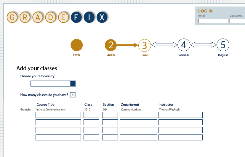
Then we combine these to show where you were to help the user understand the process.


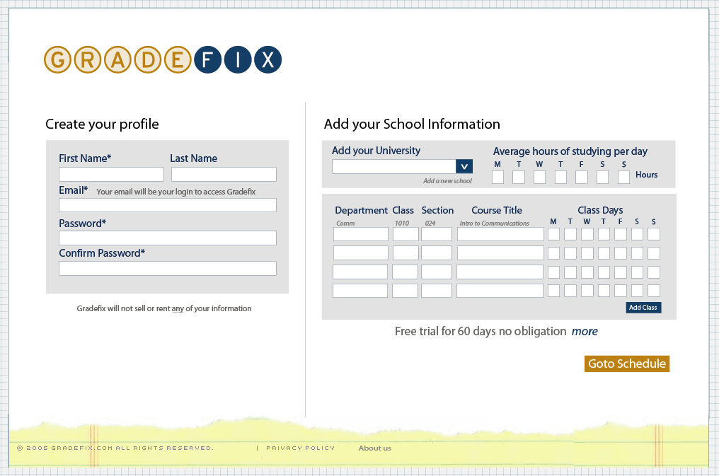
I started to think, I bet we could get this all one page. Here is how it looked.

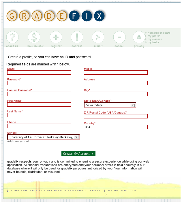
I was happy about the one page idea, but still didn’t like it yet. It dawned me even after some reduction that we were still asking for too much stuff. We ended up with something like this.

We finally got gutsy and decided to take out even more so we decided to try throw out the class, the section, the department, and the instructor out. Viola!

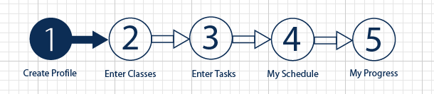
Now we had a very concise sign up. However, we realized when watching the betas that the horizontal layout wasn’t right. Our betas were much more inclined to work down than horizontally, so we made the form vertical.

When we got to this one and we finally really started feeling right about the look. The side text really helped prompt the user. Our comments from our betas were things such as “simple”, “easy on the eyes”, “not too much information”. Finally, after all that we were happy… well we hope so anyway.


In the mean time, we’d been through trial of finding a designer, getting our logo, and getting a basic layout.
Mac took our designer's look and feel and created this version of Gradefix, around December 2005 and January 2006.

We found there were some problems in this approach, mainly in that we still had no idea how all of this information would fit into the scheduler cleanly. On the input side we also faced one our biggest problems of having tons of inputs. We first thought that the user would need to enter their entire syllabi and this was going to be ridiculous.
On the profile and class pages we started by asking ourselves what was all the info we wanted, instead of what was only the essential inputs we needed.
Because our budget was so small Taylor and I took it upon us to redesign the pages using some of designers best ideas.
When our betas tried the above shown version, they didn’t understand what they were doing or where to click (as much as we thought AJAX was cool, it was hard for people to use at least for our app). My first thought was maybe I should show them a step-by-step bar to let them know where they were at in the process of signing up, so I made this one.
We made sort our own profile and class layout as seen here:
Then we combine these to show where you were to help the user understand the process.

I started to think, I bet we could get this all one page. Here is how it looked.
I was happy about the one page idea, but still didn’t like it yet. It dawned me even after some reduction that we were still asking for too much stuff. We ended up with something like this.

We finally got gutsy and decided to take out even more so we decided to try throw out the class, the section, the department, and the instructor out. Viola!

Now we had a very concise sign up. However, we realized when watching the betas that the horizontal layout wasn’t right. Our betas were much more inclined to work down than horizontally, so we made the form vertical.

When we got to this one and we finally really started feeling right about the look. The side text really helped prompt the user. Our comments from our betas were things such as “simple”, “easy on the eyes”, “not too much information”. Finally, after all that we were happy… well we hope so anyway.
posted by mark at 8:33 PM
![]()
![]()

1 Comments:
I like the refreshingly simple and stylish look GradeFix has. What a fantastic program this will be for students. If only I had such a tool for when I was going to school!
Post a Comment
<< Home